Commercial Interior – Warehouse Cum Office
Glosil Scientific
Client : Mr. Rajesh kumar-D
Size : 5223 Sq.ft
Completion Date : Sep-20
Location : Egmore
A Creative Approach begins
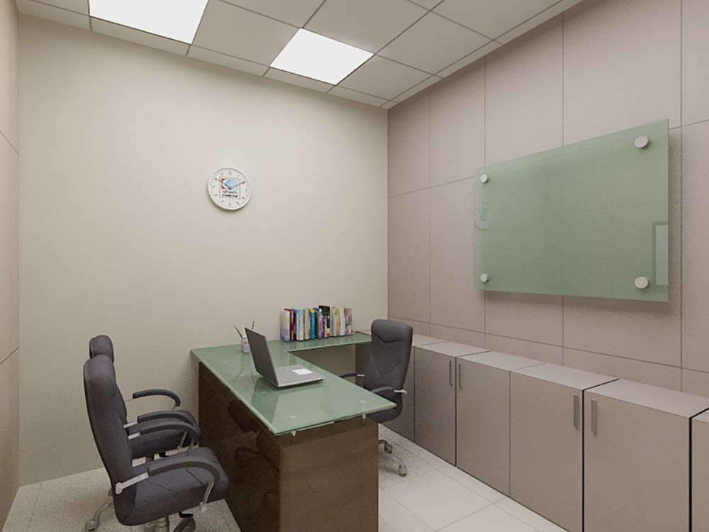
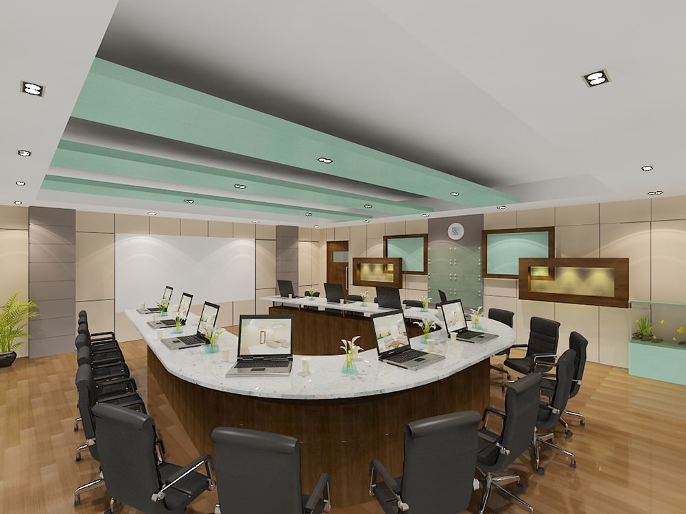
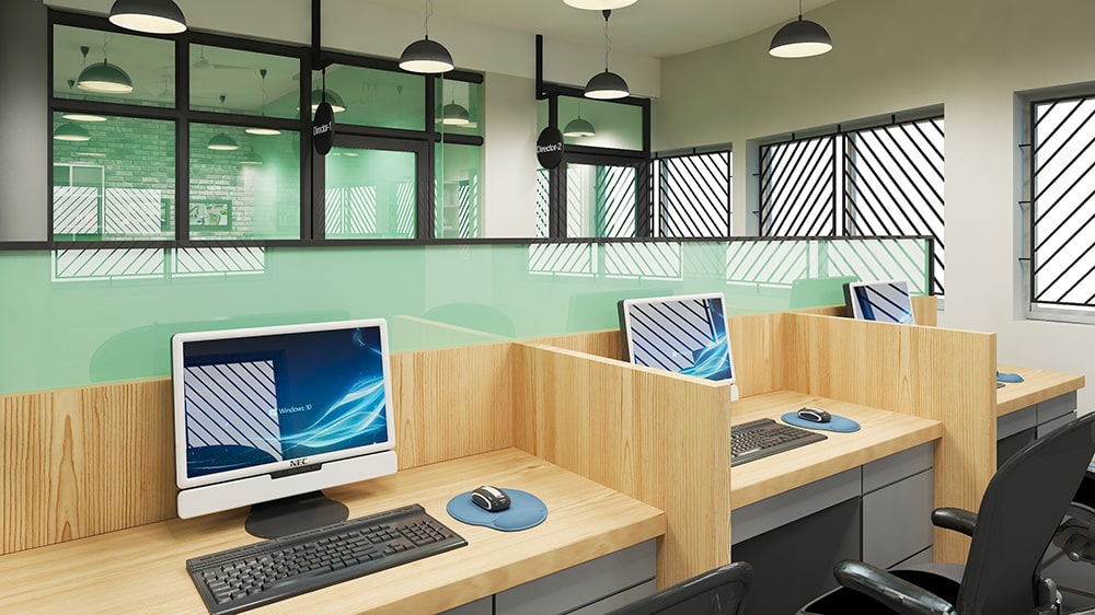
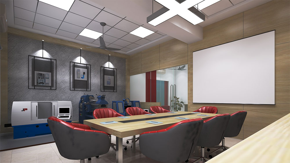
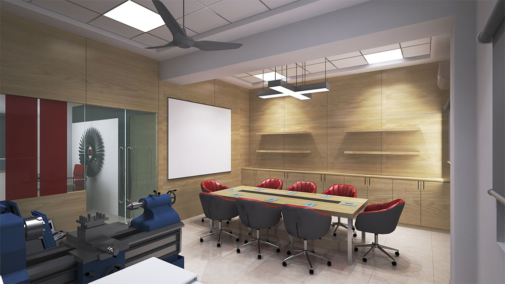
Glosil Scientific, a prominent distributor and stockist of high-performance analytical and scientific instruments in India, is seeking a unique and distinctive design for their facility. The client envisions a layout that breaks away from the traditional warehouse setup. Alongside this, there is a desire to integrate a well-organized office space within the warehouse premises.
A Multifaceted Workspace
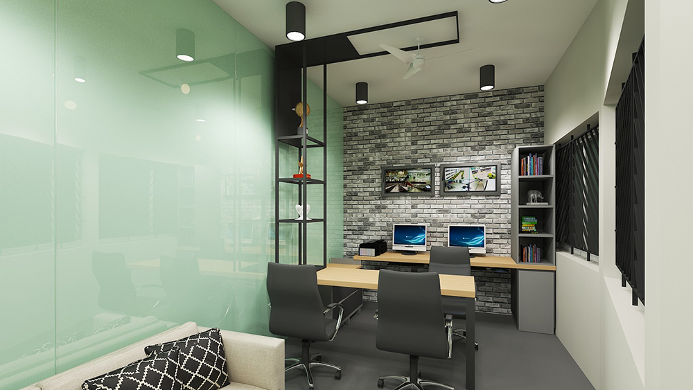
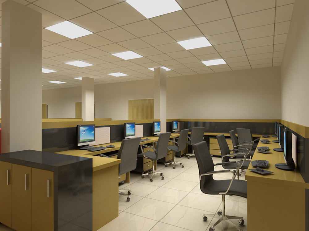
With an aim to create an unconventional and engaging environment for storing instruments and machinery, our focus is on infusing creativity into the design, departing from the standard warehouse aesthetic. The inclusion of a well-planned office space suggests a holistic approach to the project, where functionality and aesthetics converge to form a distinctive and purposeful workspace.
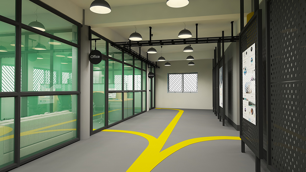
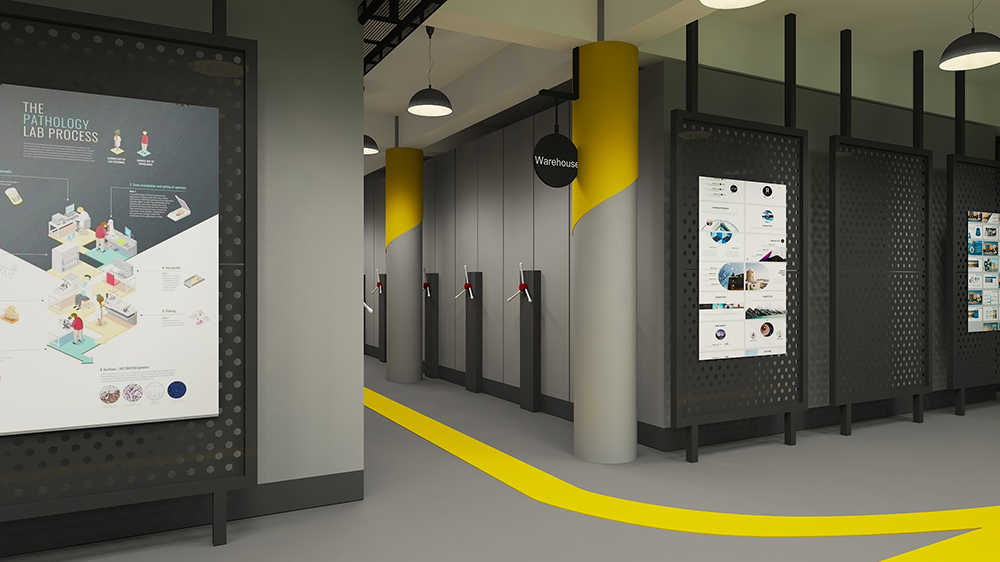
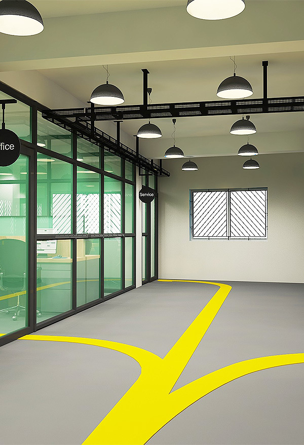
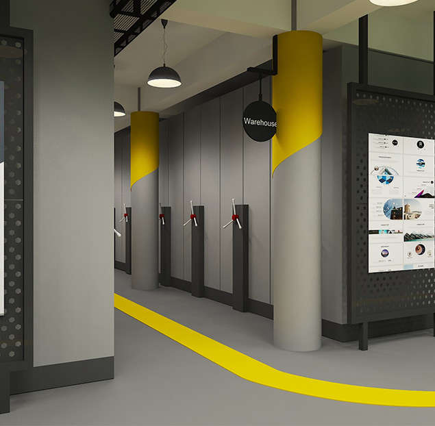
The first challenge we faced in this project was the space plan. Integrating a warehouse and an office within the same space required meticulous planning to ensure the efficient movement of goods and materials while simultaneously providing a secluded workspace. To address this challenge, we devised a navigation path marked by vivid yellow lines on epoxy flooring. This path not only facilitated the smooth flow of personnel and materials through the warehouse but also introduced a visually appealing element to the space.
The strategic placement of yellow markings enhanced the aesthetic appeal of the warehouse and also served as a practical guide for the movement of goods and materials.
Bridging the Gap through Partition
Placement of the compactor in a warehouse with
columns posed a significant challenge.
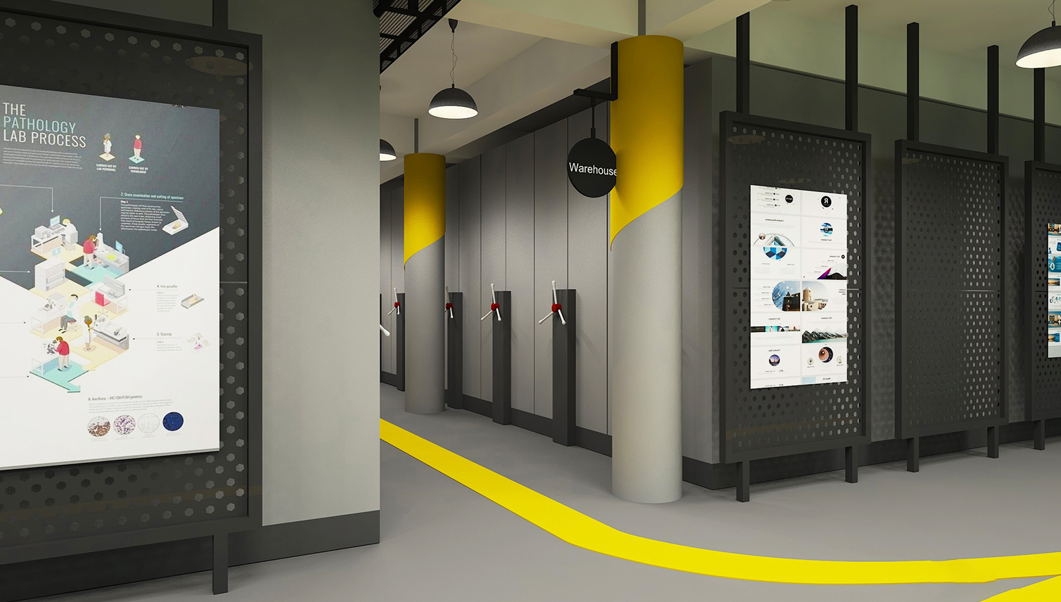
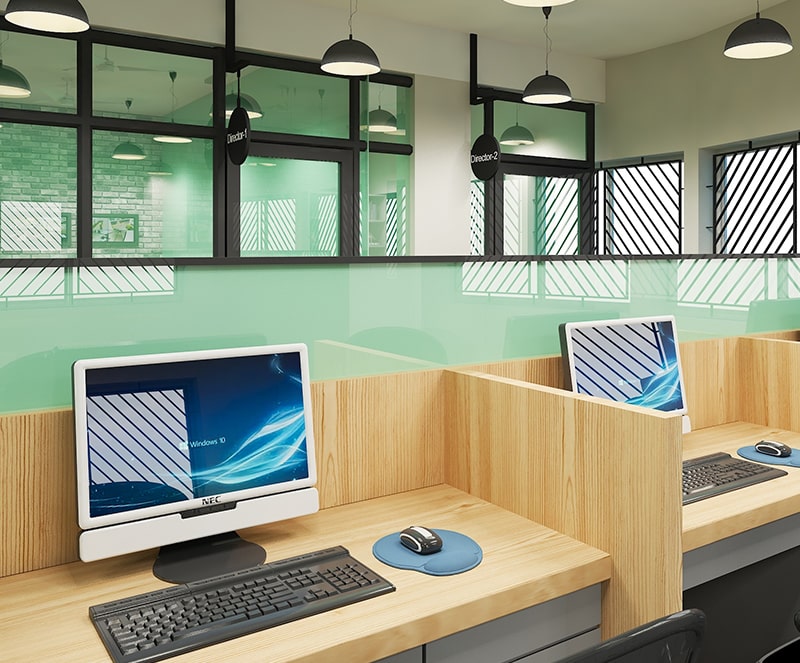
To optimize space usage, we divided the compactors into three segments. This strategic arrangement ensures maximum capacity utilization. Another hurdle we overcame was creating a partition between the busy warehouse and the peaceful office. Our solution involved a robust MS structure that effectively separates the two areas while allowing smooth movement of goods, materials, and personnel.
Purpose beyond specific division
This thoughtfully designed partition served multiple purposes beyond its primary function of spatial division. Its sturdy surface provided an ideal canvas for the client to showcase their company’s brand and messaging through magnetic posters, host events, meetings, and conferences, fostering collaboration and communication between the two distinct work environments.
The Art of Space
Utilization
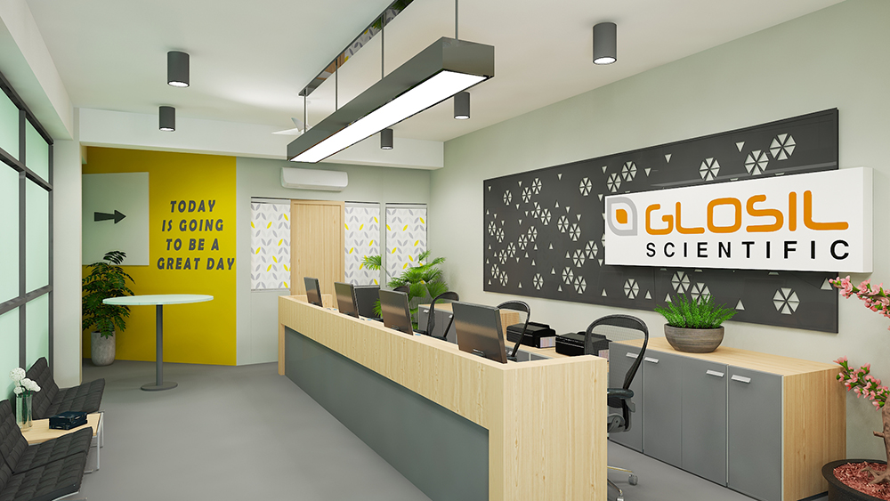
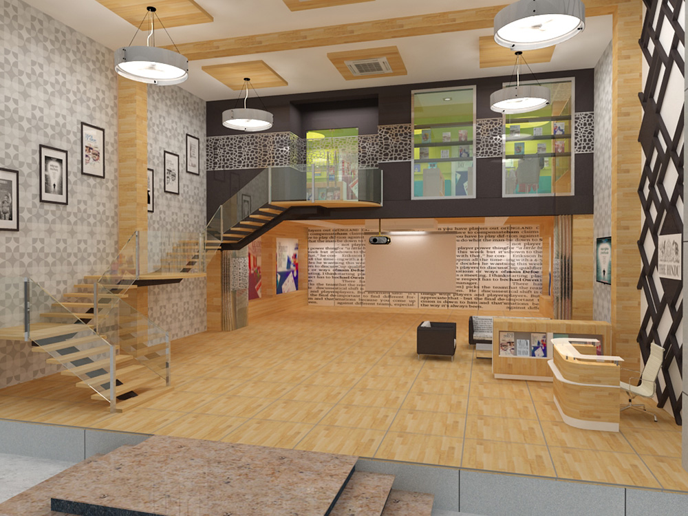
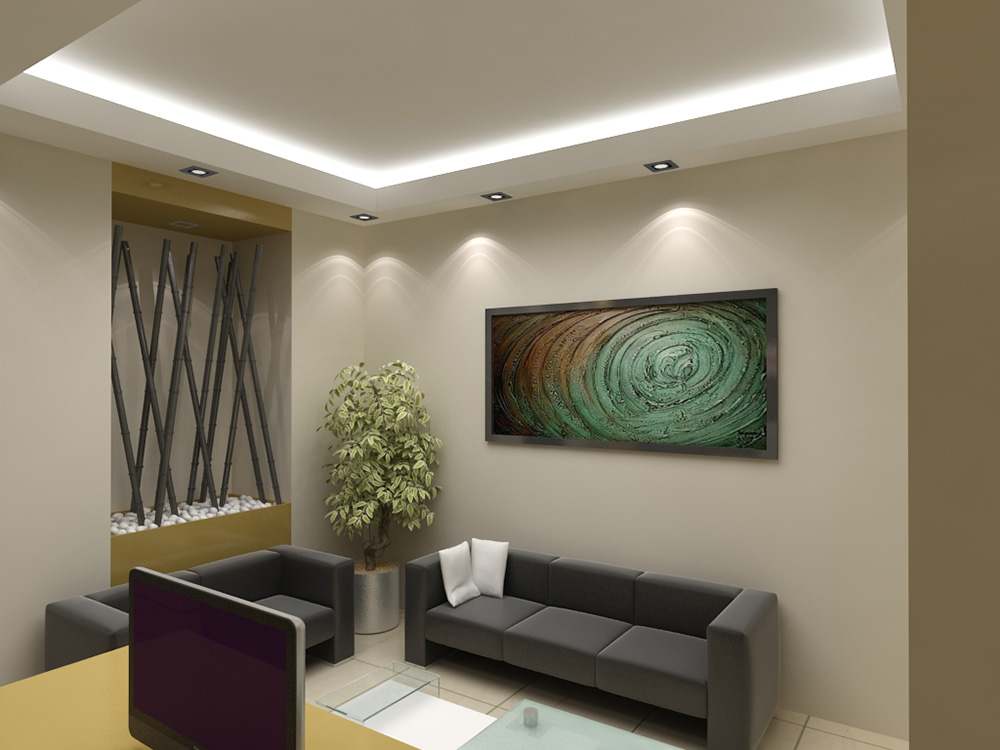
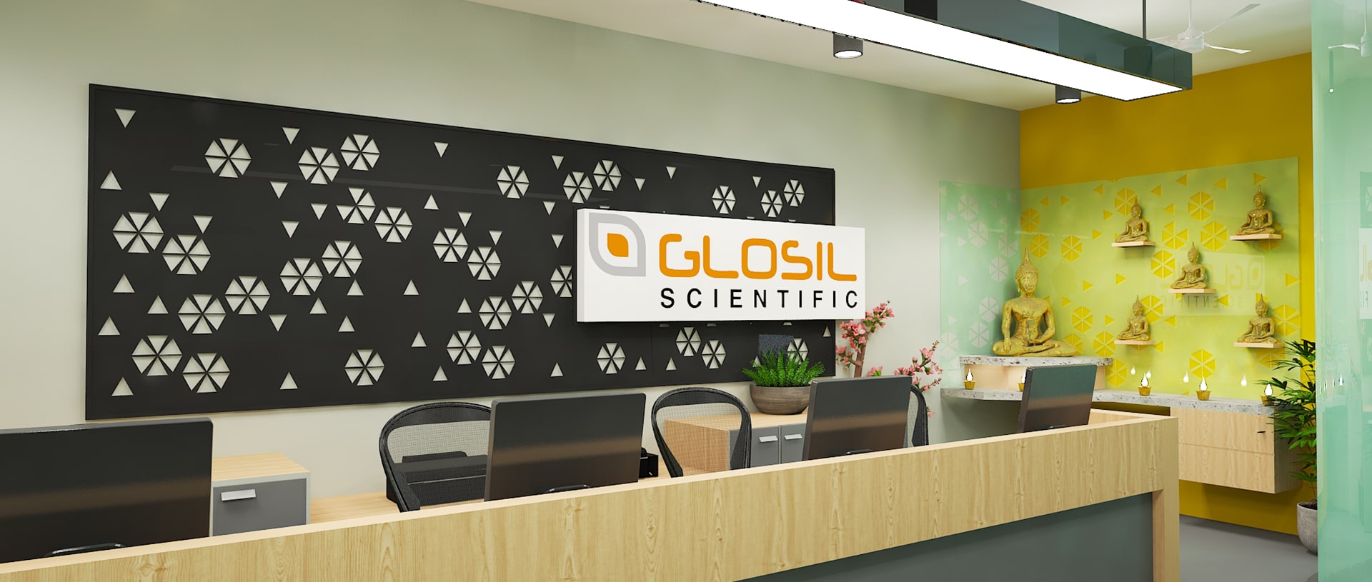
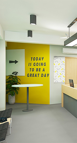
The entrance to the office was another area that received our creative attention. We carefully designed the name board and the steel frame behind the reception desk, and seating ensuring that it adhered perfectly to the principles of Vastu. The name board was expertly laser cut from MS steel and illuminated with a captivating backlight, creating a visually striking and welcoming entrance to the office.
During the interior design process, we discovered a small unused space. Instead of leaving it vacant, we ingeniously transformed it into a dedicated product placement area. By strategically positioning a coffee table-like piece of furniture. This thoughtful addition served a functional purpose and also showcased our commitment to making the most of every square foot.

The client expressed great satisfaction with the ultimate outcome, leading them to engage our services once again when acquiring an additional warehouse. They requested our expertise in developing a space plan for the new facility, underscoring the success of our initial design and our capacity to cater to the distinctive requirements of our clients.
Gallery




Inspiring and transforming spaces
through innovative architectural design


testimonial
blog
Discover, Inspire, Create
Explore our blog for insightful articles on architectural trends, design inspiration, and expert tips. Discover how IDAS Architects can elevate your space and bring your vision to life.


